---
output:
html_document
bibliography: ref.bib
---
# Integrating with protein abundance
## Motivation
Cellular indexing of transcriptomes and epitopes by sequencing (CITE-seq) is a technique that quantifies both gene expression and the abundance of selected surface proteins in each cell simultaneously [@stoeckius2017simultaneous].
In this approach, cells are first labelled with antibodies that have been conjugated to synthetic RNA tags.
A cell with a higher abundance of a target protein will be bound by more antibodies, causing more molecules of the corresponding antibody-derived tag (ADT) to be attached to that cell.
Cells are then separated into their own reaction chambers using droplet-based microfluidics [@zheng2017massively].
Both the ADTs and endogenous transcripts are reverse-transcribed and captured into a cDNA library; the abundance of each protein or expression of each gene is subsequently quantified by sequencing of each set of features.
This provides a powerful tool for interrogating aspects of the proteome (such as post-translational modifications) and other cellular features that would normally be invisible to transcriptomic studies.
How should the ADT data be incorporated into the analysis?
While we have counts for both ADTs and transcripts, there are fundamental differences in nature of the data that make it difficult to treat the former as additional features in the latter.
Most experiments involve only a small number (20-200) of antibodies that are chosen by the researcher because they are of _a priori_ interest, in contrast to gene expression data that captures the entire transcriptome regardless of the study.
The coverage of the ADTs is also much deeper as they are sequenced separately from the transcripts, allowing the sequencing resources to be concentrated into a smaller number of features.
And, of course, the use of antibodies against protein targets involves consideration of separate biases compared to those observed for transcripts.
This chapter will describe some strategies for integrated analysis of ADT and transcript data in CITE-seq experiments.
## Setting up the data
We will demonstrate using a PBMC dataset from 10X Genomics that contains quantified abundances for a number of interesting surface proteins.
We obtain the dataset using the *[DropletTestFiles](https://bioconductor.org/packages/3.17/DropletTestFiles)* package, after which we can create a `SingleCellExperiment` as shown below.
```r
library(DropletTestFiles)
path <- getTestFile("tenx-3.0.0-pbmc_10k_protein_v3/1.0.0/filtered.tar.gz")
dir <- tempfile()
untar(path, exdir=dir)
# Loading it in as a SingleCellExperiment object.
library(DropletUtils)
sce <- read10xCounts(file.path(dir, "filtered_feature_bc_matrix"))
sce
```
```
## class: SingleCellExperiment
## dim: 33555 7865
## metadata(1): Samples
## assays(1): counts
## rownames(33555): ENSG00000243485 ENSG00000237613 ... IgG1 IgG2b
## rowData names(3): ID Symbol Type
## colnames: NULL
## colData names(2): Sample Barcode
## reducedDimNames(0):
## mainExpName: NULL
## altExpNames(0):
```
The `SingleCellExperiment` class provides the concept of an "alternative Experiment" to store data for different sets of features but the same cells.
This involves storing another `SummarizedExperiment` (or an instance of a subclass) _inside_ our `SingleCellExperiment` where the rows (features) can differ but the columns (cells) are the same.
In previous chapters, we were using the alternative Experiments to store spike-in data, but here we will use the concept to split off the ADT data.
This isolates the two sets of features to ensure that analyses on one set do not inadvertently use data from the other set, and vice versa.
```r
sce <- splitAltExps(sce, rowData(sce)$Type)
altExpNames(sce)
```
```
## [1] "Antibody Capture"
```
```r
altExp(sce) # Can be used like any other SingleCellExperiment.
```
```
## class: SingleCellExperiment
## dim: 17 7865
## metadata(1): Samples
## assays(1): counts
## rownames(17): CD3 CD4 ... IgG1 IgG2b
## rowData names(3): ID Symbol Type
## colnames: NULL
## colData names(0):
## reducedDimNames(0):
## mainExpName: NULL
## altExpNames(0):
```
```r
counts(altExp(sce))[,1:10] # sneak peek
```
```
## 17 x 10 sparse Matrix of class "dgCMatrix"
##
## CD3 18 30 18 18 5 21 34 48 4522 2910
## CD4 138 119 207 11 14 1014 324 1127 3479 2900
## CD8a 13 19 10 17 14 29 27 43 38 28
## CD14 491 472 1289 20 19 2428 1958 2189 55 41
## CD15 61 102 128 124 156 204 607 128 111 130
## CD16 17 155 72 1227 1873 148 676 75 44 37
## CD56 17 248 26 491 458 29 29 29 30 15
## CD19 3 3 8 5 4 7 15 4 6 6
## CD25 9 5 15 15 16 52 85 17 13 18
## CD45RA 110 125 5268 4743 4108 227 175 523 4044 1081
## CD45RO 74 156 28 28 21 492 517 316 26 43
## PD-1 9 9 20 25 28 16 26 16 28 16
## TIGIT 4 9 11 59 76 11 12 12 9 8
## CD127 7 8 12 16 17 15 11 10 231 179
## IgG2a 5 4 12 12 7 9 6 3 19 14
## IgG1 2 8 19 16 14 10 12 7 16 10
## IgG2b 3 3 6 4 9 8 50 2 8 2
```
## Quality control
### Issues with RNA-based metrics
As in the RNA-based analysis, we want to remove cells that have failed to capture/sequence the ADTs.
Ideally, we would re-use the QC metrics and strategies described in Chapter \@ref(quality-control).
Unfortunately, this is complicated by some key differences between ADT and RNA count data.
In particular, the features in a CITE-seq experiment are usually chosen because they capture interesting variation.
This enriches for biology, which is desirable, but also makes it difficult to separate biological and technical effects.
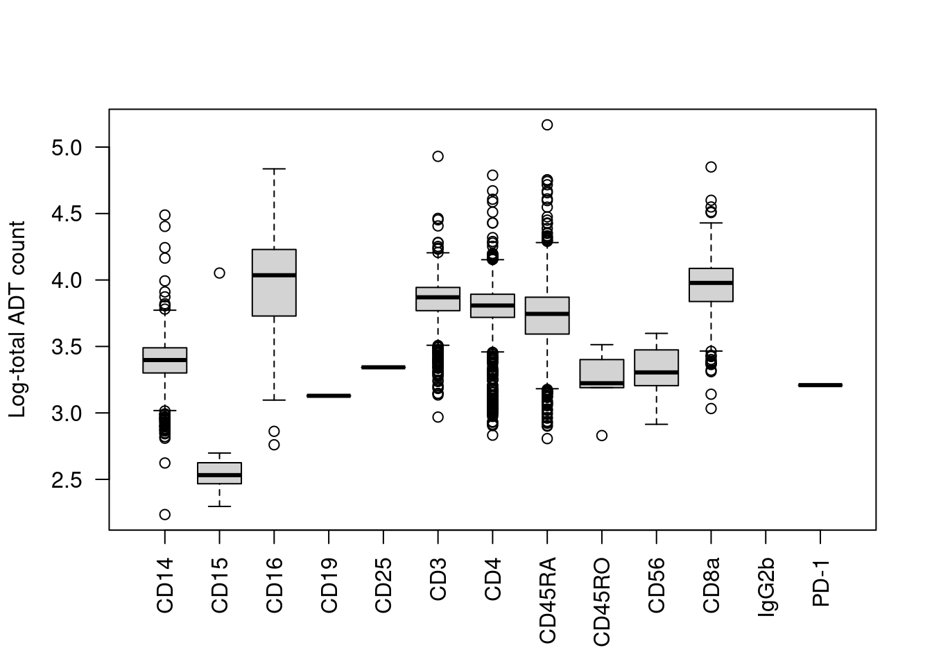
We start with the most obvious QC metric, the total count across all ADTs in a cell.
The presence of a targeted protein can lead to a several-fold increase in the total ADT count given the binary nature of most surface markers.
For example, the most abundant marker in each cell is variable and associated with order of magnitude changes in the total ADT count (Figure \@ref(fig:top-prop-adt-dist)).
Removing cells with low total ADT counts could inadvertently eliminate cell types that do not express many - or indeed, any - of the selected protein targets.
```r
adt.counts <- counts(altExp(sce))
top.marker <- rownames(adt.counts)[max.col(t(adt.counts))]
total.count <- colSums(adt.counts)
boxplot(split(log10(total.count), top.marker), ylab="Log-total ADT count", las=2)
```
(\#fig:top-prop-adt-dist)Distribution of the log~10~-total ADT count across cells, stratified by the identity of the most abundant marker in each cell.
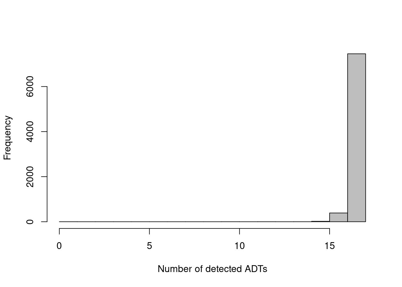
The other common metric is the number of features detected (i.e., with non-zero counts) in each cell, but again, this is not as helpful for ADTs compared to RNA data.
Recall that droplet-based libraries will contain contamination from ambient solution (Section \@ref(qc-droplets)), in this case containing containing conjugated antibodies that are either free in solution or bound to cell fragments.
As the ADTs are relatively deeply sequenced, we expect non-zero counts for most ADTs in each cell due to these contaminating transcripts.
This may result in near-identical values for all cells (Figure \@ref(fig:cite-detected-ab-hist)) regardless of the efficacy of cDNA capture.
```r
adt.detected <- colSums(adt.counts > 0)
hist(adt.detected, col='grey', main="", xlab="Number of detected ADTs")
```
(\#fig:cite-detected-ab-hist)Distribution of the number of detected ADTs across all cells in the PBMC dataset.
Contrast this with the utility of the same QC metrics for the RNA counts.
Most counts in an RNA-seq library are assigned to constitutively expressed genes that should not exhibit major changes across subpopulations,
allowing us to use the total RNA count as a QC metric that is somewhat independent of biological state.
Similarly, the larger number of features keeps the counts close to zero and ensures that the number of detected genes changes appreciably in response to technical effects.
This suggests that, for a larger antibody panel (including some constitutively abundant proteins) and shallower sequencing, the ADT count matrix may be sufficiently "RNA-like" that these metrics can be used in the same way.
Obviously, the mitochondrial and spike-in proportions are not applicable here.
### Applying custom QC filters
To replace the standard QC metrics, we take advantage of one of the more obvious technical effects in ADT data - namely, contamination from the ambient solution.
As previously mentioned, we expect non-zero counts for most ADTs due to this contamination,
even if the cell does not exhibit any actual expression of the corresponding protein marker.
If most ADTs for a cell instead have zero counts, we may suspect a problem during library preparation.
We identify such libraries that have no estimated contribution from the ambient solution and mark them for removal during QC filtering.
```r
controls <- grep("^Ig", rownames(altExp(sce))) # see below for details.
qc.stats <- cleanTagCounts(altExp(sce), controls=controls)
summary(qc.stats$zero.ambient) # libraries removed with no ambient contamination
```
```
## Mode FALSE TRUE
## logical 7864 1
```
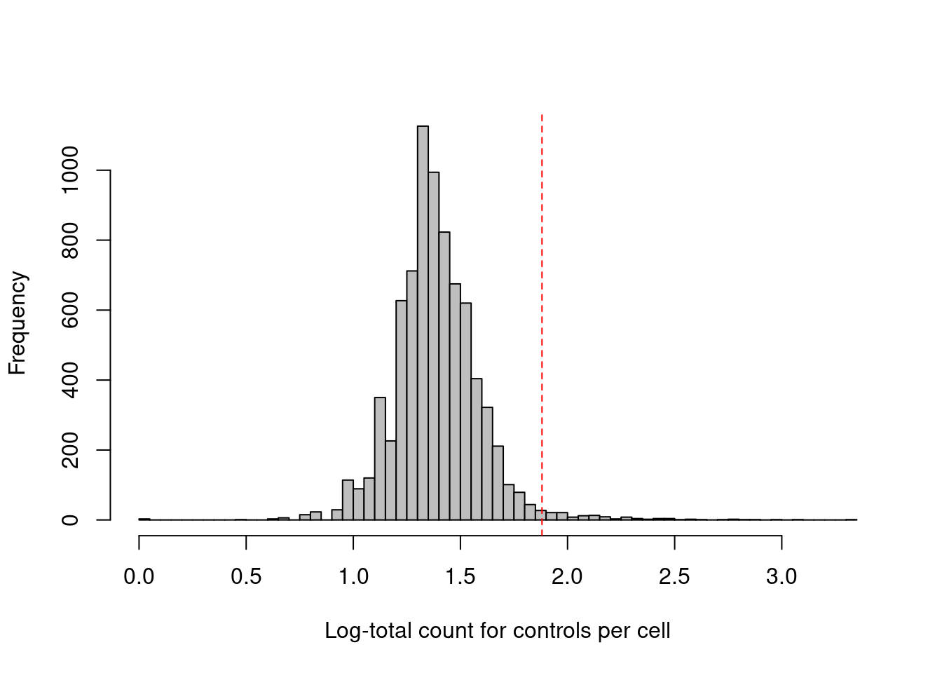
This experiment also includes isotype control (IgG) antibodies that have similar properties to a primary antibody but lack a specific target in the cell.
The coverage of these control ADTs serves as a measure of non-specific binding in each cell, most notably protein aggregates.
Inclusion of antibody aggregates in a droplet causes a large increase in the counts for all tags in the corresponding library,
which interferes with the downstream analysis by masking the cell's true surface marker phenotype.
We identify affected cells as high outliers for the total control count (Figure \@ref(fig:cite-total-con-hist));
hard thresholds are more difficult to specify due to experiment-by-experiment variation in the expected coverage of ADTs.
```r
summary(qc.stats$high.controls)
```
```
## Mode FALSE TRUE
## logical 7730 135
```
```r
hist(log10(qc.stats$sum.controls + 1), col='grey', breaks=50,
main="", xlab="Log-total count for controls per cell")
thresholds <- attr(qc.stats$high.controls, "thresholds")
abline(v=log10(thresholds["higher"]+1), col="red", lty=2)
```
(\#fig:cite-total-con-hist)Distribution of the log-coverage of IgG control ADTs across all cells in the PBMC dataset. The red dotted line indicates the threshold above which cells were removed.
If we want to analyze gene expression and ADT data together, we still need to apply quality control on the gene counts.
It is possible for a cell to have satisfactory ADT counts but poor QC metrics from the endogenous genes - for example, cell damage manifesting as high mitochondrial proportions would not be captured in the ADT data.
More generally, the ADTs are synthetic, external to the cell and conjugated to antibodies, so it is not surprising that they would experience different cell-specific technical effects than the endogenous transcripts.
This motivates a distinct QC step on the genes to ensure that we only retain high-quality cells in both feature spaces.
Here, the count matrix has already been filtered by _Cellranger_ to remove empty droplets so we only filter on the mitochondrial proportions to remove putative low-quality cells.
```r
library(scuttle)
mito <- grep("^MT-", rowData(sce)$Symbol)
df <- perCellQCMetrics(sce, subsets=list(Mito=mito))
mito.discard <- isOutlier(df$subsets_Mito_percent, type="higher")
summary(mito.discard)
```
```
## Mode FALSE TRUE
## logical 7569 296
```
Finally, to remove the low-quality cells, we subset the `SingleCellExperiment` as previously described.
This automatically applies the filtering to both the transcript and ADT data; such coordination is one of the advantages of storing both datasets in a single object.
Helpfully, `cleanTagCounts()` also provides a `discard` field containing the intersection of the ADT-specific filters described above.
```r
unfiltered <- sce
discard <- qc.stats$discard | mito.discard
sce <- sce[,!discard]
ncol(sce)
```
```
## [1] 7472
```
### Other comments
An additional motivation for the initial `zero.ambient` filter is to ensure that the size factors in Section \@ref(cite-seq-median-norm) will always be positive.
For different normalization schemes, another filter may be preferred, e.g., removing cells with low total control counts to facilitate control-based normalization.
However, the overall goal remains the same - to remove cells with unusually low coverage, presumably due to failed capture or sequencing.
In the absence of control ADTs, protein aggregates can be difficult to distinguish from cells that genuinely express multiple markers.
A workaround is to assume that most markers are not actually expressed by each cell -
we then estimate the amount of ambient contamination in each droplet,
allowing us to remove high outliers that presumably represent droplets contaminated by protein aggregates.
(This is done automatically for us by `cleanTagCounts()` if controls are not supplied.)
However, this strategy is not appropriate for small antibody panels where a majority of markers may be expressed.
```r
qc.stats.amb <- cleanTagCounts(altExp(sce))
summary(qc.stats.amb$high.ambient)
```
```
## Mode FALSE TRUE
## logical 7240 232
```
A more assumption-laden approach can be implemented by passing a set of mutually exclusive markers to `cleanTagCounts()`.
This eliminates cells that exhibit high expression for more than one such marker, presumably due to contamination by aggregates (or doublet formation).
In this manner, we eliminate marker combinations that are nonsensical based on prior biological knowledge.
Needless to say, this is not a comprehensive approach but at least the worst offenders can be filtered out.
```r
qc.stats.amb <- cleanTagCounts(altExp(sce), exclusive=c("CD3", "CD19"))
summary(qc.stats.amb$high.ambient)
```
```
## Mode FALSE TRUE
## logical 7429 43
```
It is also worth mentioning that, for 10X Genomics datasets, _Cellranger_ applies its own [algorithm to remove protein aggregates](https://support.10xgenomics.com/single-cell-gene-expression/software/pipelines/latest/algorithms/antibody).
## Normalization
### Overview
Counts for the ADTs are subject to several biases that must be normalized prior to further analysis.
Capture efficiency varies from cell to cell though the differences in biophysical properties between endogenous transcripts and the (much shorter) ADTs means that the capture-related biases for the two sets of features are unlikely to be identical.
Composition biases are also much more pronounced in ADT data due to (i) the binary nature of target protein abundances, where any increase in protein abundance manifests as a large increase to the total tag count; and (ii) the _a priori_ selection of interesting protein targets, which enriches for features that are more likely to be differentially abundant across the population.
As in Chapter \@ref(normalization), we assume that these are scaling biases and compute ADT-specific size factors to remove them.
To this end, several strategies are again available to calculate a size factor for each cell.
### Library size normalization
The simplest approach is to normalize on the total ADT counts, effectively the library size for the ADTs.
Like in Section \@ref(library-size-normalization), these "ADT library size factors" are adequate for clustering but will introduce composition biases that interfere with interpretation of the fold-changes between clusters.
This is especially true for relatively subtle (e.g., ~2-fold) changes in the abundances of markers associated with functional activity rather than cell type.
```r
sf.lib <- librarySizeFactors(altExp(sce))
summary(sf.lib)
```
```
## Min. 1st Qu. Median Mean 3rd Qu. Max.
## 0.028 0.541 0.933 1.000 1.301 5.264
```
We might instead consider the related approach of taking the geometric mean of all counts as the size factor for each cell [@stoeckius2017simultaneous].
The geometric mean is a reasonable estimator of the scaling biases for large counts with the added benefit that it mitigates the effects of composition biases by dampening the impact of one or two highly abundant ADTs.
While more robust than the ADT library size factors, these geometric mean-based factors are still not entirely correct and will progressively become less accurate as upregulation increases in strength.
```r
sf.geo <- geometricSizeFactors(altExp(sce))
summary(sf.geo)
```
```
## Min. 1st Qu. Median Mean 3rd Qu. Max.
## 0.075 0.708 0.912 1.000 1.148 6.637
```
### Median-based normalization {#cite-seq-median-norm}
Ideally, we would like to compute size factors that adjust for the composition biases.
This usually requires an assumption that most ADTs are not differentially expressed between cell types/states.
At first glance, this appears to be a strong assumption - the target proteins were specifically chosen as they exhibit interesting heterogeneity across the population, meaning that a non-differential majority across ADTs would be unlikely.
However, we can make it work by assuming that each cell only upregulates a minority of the targeted proteins, with the remaining ADTs exhibiting some low baseline abundance - a combination of weak constitutive expression and ambient contamination - that should be constant across the population.
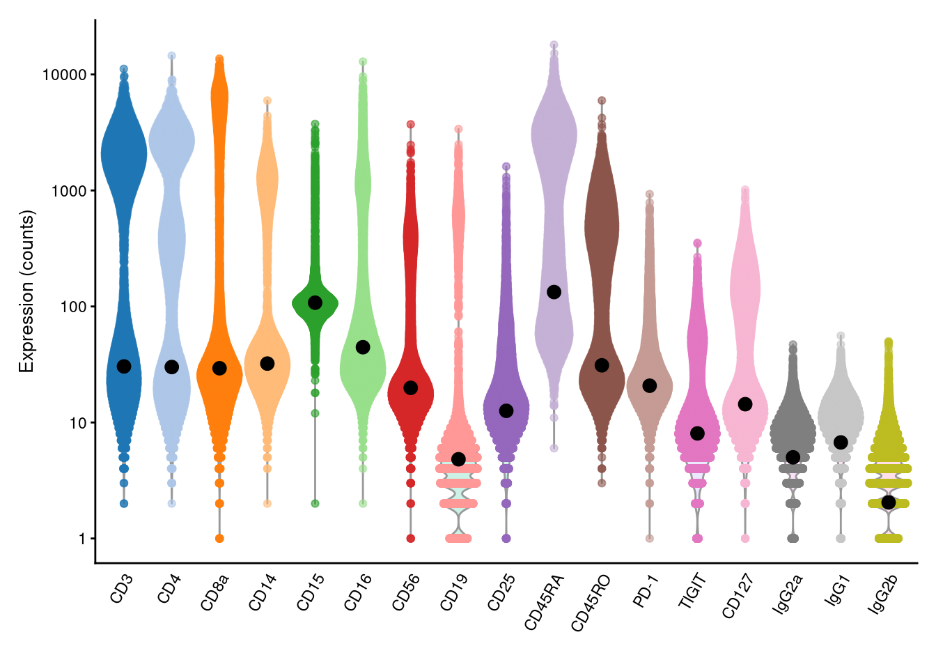
We estimate the baseline abundance profile from the ADT count matrix by assuming that the distribution of abundances for each ADT should be bimodal.
In this model, one population of cells exhibits low baseline expression while another population upregulates the corresponding protein target.
We use all cells in the lower mode to compute the baseline abundance for that ADT, as shown below with the `ambientProfileBimodal()` function.
We can also use other baseline profiles here - one alternative would be the ambient solution computed from empty droplets (Section \@ref(qc-droplets)).
```r
baseline <- ambientProfileBimodal(altExp(sce))
head(baseline)
```
```
## CD3 CD4 CD8a CD14 CD15 CD16
## 30.43 30.06 29.33 32.18 107.78 44.54
```
```r
library(scater)
plotExpression(altExp(sce), features=rownames(altExp(sce)), exprs_values="counts") +
scale_y_log10() +
geom_point(data=data.frame(x=names(baseline), y=baseline), mapping=aes(x=x, y=y), cex=3)
```
(\#fig:pbmc-adt-ambient-profile)Distribution of (log-)counts for each ADT in the PBMC dataset, with the inferred ambient abundance marked by the black dot.
We then compute size factors to equalize the coverage of the non-upregulated majority, thus eliminating cell-to-cell differences in capture efficiency.
We use a *[DESeq2](https://bioconductor.org/packages/3.17/DESeq2)*-like approach where the size factor for each cell is defined as the median of the ratios of that cell's counts to the baseline profile.
If the abundances for most ADTs in each cell are baseline-derived, they should be roughly constant across cells;
any systematic differences in the ratios correspond to cell-specific biases in sequencing coverage and are captured by the size factor.
The use of the median protects against the minority of ADTs corresponding to genuinely expressed targets.
```r
sf.amb <- medianSizeFactors(altExp(sce), reference=baseline)
summary(sf.amb)
```
```
## Min. 1st Qu. Median Mean 3rd Qu. Max.
## 0.025 0.723 0.877 1.000 1.091 12.640
```
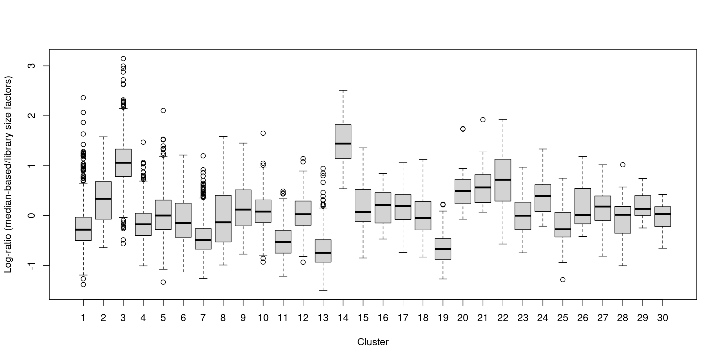
In one subpopulation, the size factors are consistently larger than the ADT library size factors, whereas the opposite is true for most of the other subpopulations (Figure \@ref(fig:comp-bias-norm)).
This is consistent with the presence of composition biases due to differential abundance of the targeted proteins between subpopulations.
Here, composition biases would introduce a spurious 2-fold change in normalized ADT abundance if the library size factors were used.
```r
# We're getting a little ahead of ourselves here, in order to define some
# clusters to make this figure; see the next section for more details.
library(scran)
tagdata <- logNormCounts(altExp(sce))
clusters <- clusterCells(tagdata, assay.type="logcounts")
by.clust <- split(log2(sf.amb/sf.lib), clusters)
boxplot(by.clust, xlab="Cluster", ylab="Log-ratio (median-based/library size factors)")
```
(\#fig:comp-bias-norm)Distribution of the log-ratio of the median-based size factor to the corresponding ADT library size factor for each cell in the PBMC dataset, stratified according to the cluster identity defined from normalized ADT data.
### Control-based normalization
If control ADTs are available, we could make the assumption that they should not be differentially abundant between cells.
Any difference thus represents some bias that should be normalized by defining control-based size factors from the sum of counts over all control ADTs, analogous to spike-in normalization ([Basic Section 2.4](http://bioconductor.org/books/3.17/OSCA.basic/normalization.html#spike-norm)),
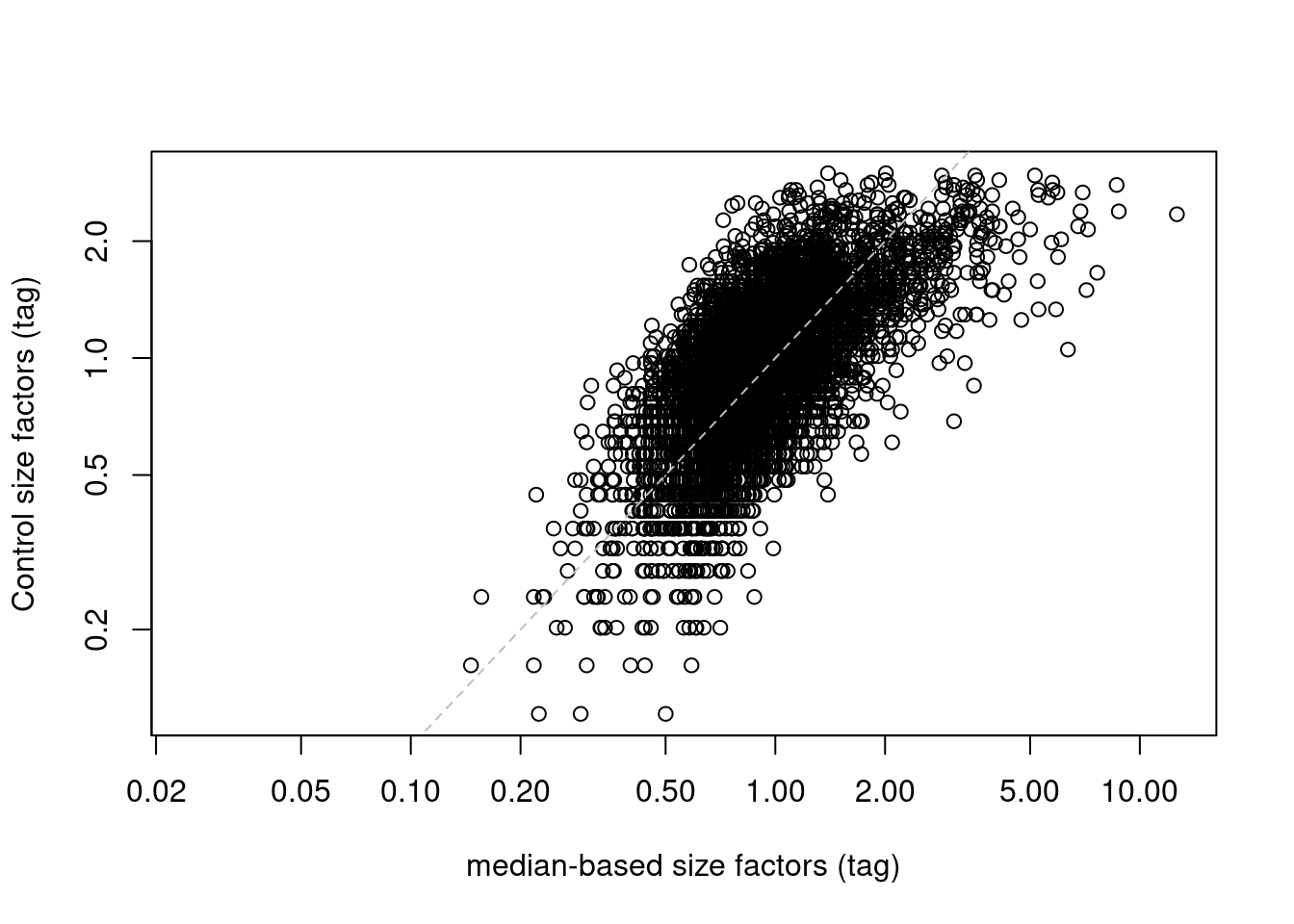
We demonstrate this approach below by computing size factors from the IgG controls (Figure \@ref(fig:control-bias-norm)).
```r
controls <- grep("^Ig", rownames(altExp(sce)))
sf.control <- librarySizeFactors(altExp(sce), subset_row=controls)
summary(sf.control)
```
```
## Min. 1st Qu. Median Mean 3rd Qu. Max.
## 0.000 0.688 0.930 1.000 1.213 2.993
```
```r
plot(sf.amb, sf.control, log="xy",
xlab="median-based size factors (tag)",
ylab="Control size factors (tag)")
abline(0, 1, col="grey", lty=2)
```
(\#fig:control-bias-norm)IgG control-derived size factors for each cell in the PBMC dataset, compared to the median-based size factors. The dashed line represents equality.
This approach exchanges the previous assumption of a non-differential majority for another assumption about the lack of differential abundance in the control tags.
We might feel that the latter is a generally weaker assumption, but it is possible for non-specific binding to vary due to biology (e.g., when the cell surface area increases), at which point this normalization strategy may not be appropriate.
It also relies on sufficient coverage of the control ADTs, which is not always possible in well-executed experiments where there is little non-specific binding to provide such counts.
### Computing log-normalized values
We suggest using the median-based size factors by default, as they are generally applicable and eliminate most problems with composition biases.
We set the size factors for the ADT data by calling `sizeFactors()` on the relevant `altExp()`.
In contrast, `sizeFactors(sce)` refers to size factors for the gene counts, which are usually quite different.
```r
sizeFactors(altExp(sce)) <- sf.amb
```
Regardless of which size factors are chosen, running `logNormCounts()` will then perform scaling normalization and log-transformation for both the endogenous transcripts and the ADTs using their respective size factors.
Alternatively, we could run `logNormCounts()` directly on `altExp(sce)` if we only wanted to compute normalized log-abundances for the ADT data
(though in this case, we want to normalize the RNA data as we will be using it later in this chapter).
```r
sce <- applySCE(sce, logNormCounts)
# Checking that we have normalized values:
assayNames(sce)
```
```
## [1] "counts" "logcounts"
```
```r
assayNames(altExp(sce))
```
```
## [1] "counts" "logcounts"
```
## Comments on downstream analyses
### Feature selection
Unlike transcript-based counts, feature selection is largely unnecessary for analyzing ADT data.
This is because feature selection has already occurred during experimental design where the manual choice of target proteins means that all ADTs correspond to interesting features by definition.
In this particular dataset, we have fewer than 20 features so there is little scope for further filtering.
Even larger datasets will only have 100-200 features - small numbers compared to our previous selections of 1000-5000 HVGs in Chapter \@ref(feature-selection).
That said, larger datasets may benefit from a PCA step to compact the data from >100 ADTs to 10-20 PCs.
This can be easily achieved by running `runPCA()` without passing in a vector of HVGs, as demonstrated below with another CITE-seq dataset from @kotliarov2020broad.
```r
library(scRNAseq)
sce.kotliarov <- KotliarovPBMCData()
adt.kotliarov <- altExp(sce.kotliarov)
adt.kotliarov
```
```
## class: SingleCellExperiment
## dim: 87 58654
## metadata(0):
## assays(1): counts
## rownames(87): AnnexinV_PROT BTLA_PROT ... CD34_PROT CD20_PROT
## rowData names(0):
## colnames(58654): AAACCTGAGAGCCCAA_H1B1ln1 AAACCTGAGGCGTACA_H1B1ln1 ...
## TTTGTCATCGGTTCGG_H1B2ln6 TTTGTCATCTACCTGC_H1B2ln6
## colData names(0):
## reducedDimNames(0):
## mainExpName: NULL
## altExpNames(0):
```
```r
# QC.
controls <- grep("isotype", rownames(adt.kotliarov), ignore.case=TRUE)
stats.kotliarov <- cleanTagCounts(adt.kotliarov, controls=controls)
adt.kotliarov <- adt.kotliarov[,!stats.kotliarov$discard]
summary(stats.kotliarov$discard)
```
```
## Mode FALSE TRUE
## logical 58410 244
```
```r
# Normalization.
ambient <- ambientProfileBimodal(adt.kotliarov)
sizeFactors(adt.kotliarov) <- medianSizeFactors(adt.kotliarov, ref=ambient)
adt.kotliarov <- logNormCounts(adt.kotliarov)
# PCA.
adt.kotliarov <- runPCA(adt.kotliarov, ncomponents=25)
reducedDimNames(adt.kotliarov)
```
```
## [1] "PCA"
```
### Clustering and interpretation
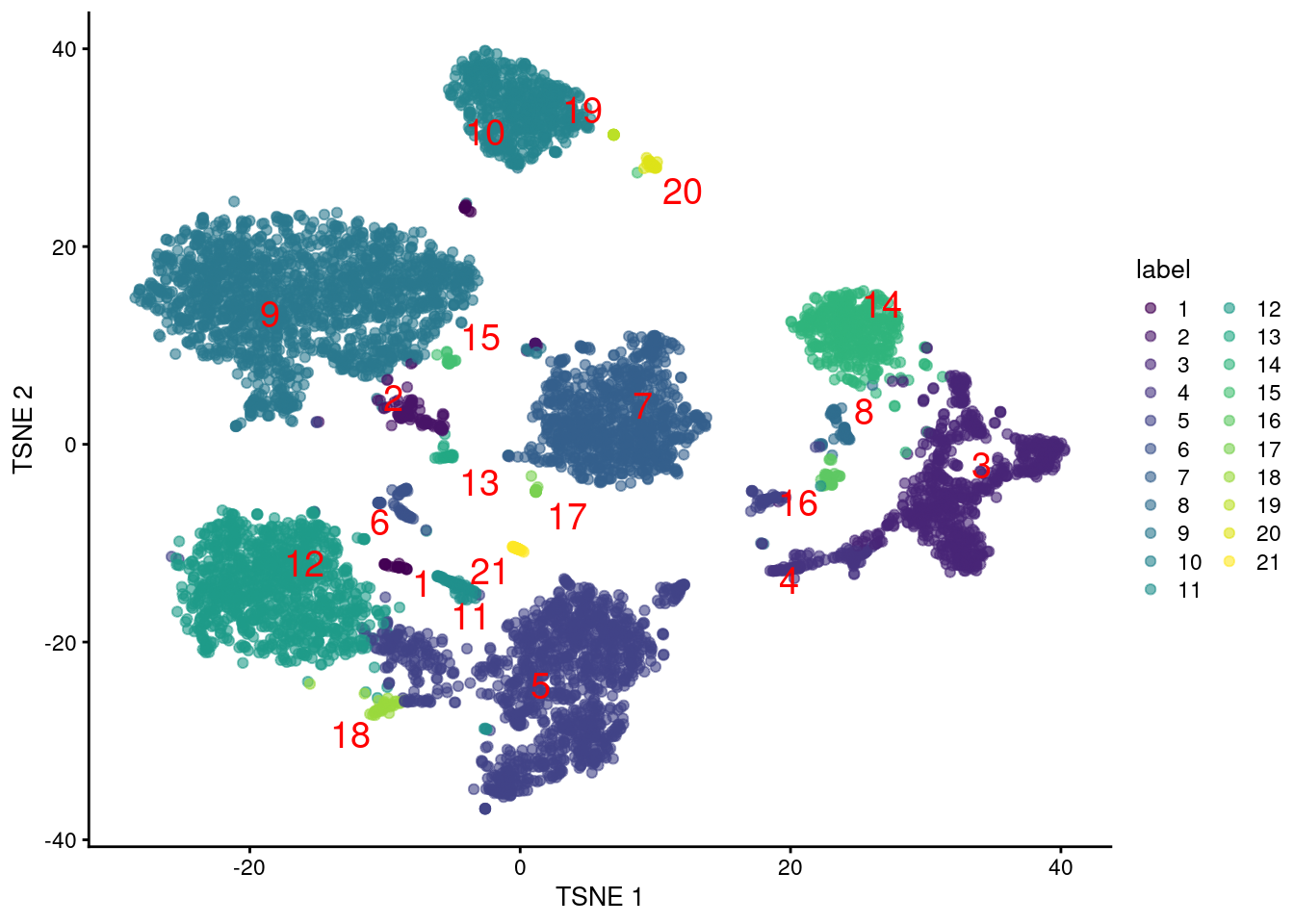
We can apply downstream procedures like clustering and visualization on the log-normalized abundance matrix for the ADTs (Figure \@ref(fig:tsne-tags)).
Alternatively, if we had generated a matrix of PCs, we could use that as well.
```r
clusters.adt <- clusterCells(altExp(sce), assay.type="logcounts")
# Generating a t-SNE plot.
library(scater)
set.seed(1010010)
altExp(sce) <- runTSNE(altExp(sce))
colLabels(altExp(sce)) <- factor(clusters.adt)
plotTSNE(altExp(sce), colour_by="label", text_by="label", text_color="red")
```
(\#fig:tsne-tags)$t$-SNE plot generated from the log-normalized abundance of each ADT in the PBMC dataset. Each point is a cell and is labelled according to its assigned cluster.
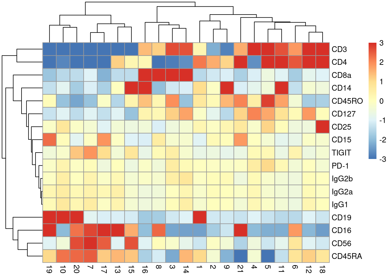
With only a few ADTs, characterization of each cluster is most efficiently achieved by creating a heatmap of the average log-abundance of each tag (Figure \@ref(fig:heat-tags)).
For this experiment, we can easily identify B cells (CD19^+^), various subsets of T cells (CD3^+^, CD4^+^, CD8^+^), monocytes and macrophages (CD14^+^, CD16^+^), to name a few.
More detailed examination of the distribution of abundances within each cluster is easily performed with `plotExpression()` where strong bimodality may indicate that finer clustering is required to resolve cell subtypes.
```r
se.averaged <- sumCountsAcrossCells(altExp(sce), clusters.adt,
exprs_values="logcounts", average=TRUE)
library(pheatmap)
averaged <- assay(se.averaged)
pheatmap(averaged - rowMeans(averaged),
breaks=seq(-3, 3, length.out=101))
```
(\#fig:heat-tags)Heatmap of the average log-normalized abundance of each ADT in each cluster of the PBMC dataset. Colors represent the log~2~-fold change from the grand average across all clusters.
Of course, this provides little information beyond what we could have obtained from a mass cytometry experiment; the real value of this data lies in the integration of protein abundance with gene expression.
## Integration with gene expression data
### By subclustering
In the simplest approach to integration, we take cells in each of the ADT-derived clusters and perform subclustering using the transcript data.
This is an _in silico_ equivalent to an experiment that performs FACS to isolate cell types followed by scRNA-seq for further characterization.
We exploit the fact that the ADT abundances are cleaner (larger counts, stronger signal) for more robust identification of broad cell types, and use the gene expression data to identify more subtle structure that manifests in the transcriptome.
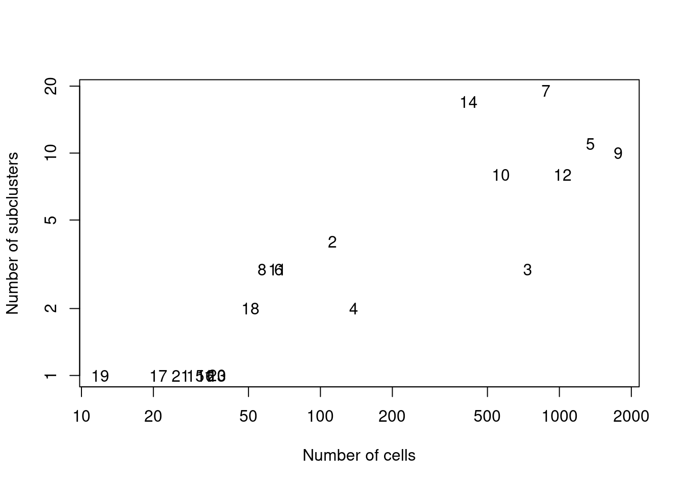
We demonstrate below by using `quickSubCluster()` to loop over all of the ADT-derived clusters and subcluster on gene expression (Figure \@ref(fig:subcluster-stats)).
```r
set.seed(101010)
all.sce <- quickSubCluster(sce, clusters.adt,
prepFUN=function(x) {
dec <- modelGeneVar(x)
top <- getTopHVGs(dec, prop=0.1)
x <- runPCA(x, subset_row=top, ncomponents=25)
},
clusterFUN=function(x) {
clusterCells(x, use.dimred="PCA")
}
)
# Summarizing the number of subclusters in each tag-derived parent cluster,
# compared to the number of cells in that parent cluster.
ncells <- vapply(all.sce, ncol, 0L)
nsubclusters <- vapply(all.sce, FUN=function(x) length(unique(x$subcluster)), 0L)
plot(ncells, nsubclusters, xlab="Number of cells", type="n",
ylab="Number of subclusters", log="xy")
text(ncells, nsubclusters, names(all.sce))
```
(\#fig:subcluster-stats)Number of subclusters identified from the gene expression data within each ADT-derived parent cluster.
Another benefit of subclustering is that we can use the annotation on the ADT-derived clusters to facilitate annotation of each subcluster.
If we knew that cluster `X` contained T cells from the ADT-derived data, there is no need to identify subclusters `X.1`, `X.2`, etc. as T cells from scratch; rather, we can focus on the more subtle (and interesting) differences between the subclusters using `findMarkers()`.
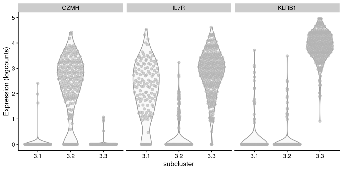
For example, cluster 3 contains CD8^+^ T cells according to Figure \@ref(fig:heat-tags), in which we further identify internal subclusters based on a variety of markers (Figure \@ref(fig:gzmh-cd8-t)).
Subclustering is also conceptually appealing as it avoids comparing log-fold changes in protein abundances with log-fold changes in gene expression.
This ensures that variation (or noise) from the transcript counts does not compromise cell type/state identification from the relatively cleaner ADT counts.
```r
of.interest <- "3"
markers <- c("GZMH", "IL7R", "KLRB1")
plotExpression(all.sce[[of.interest]], x="subcluster",
features=markers, swap_rownames="Symbol", ncol=3)
```
(\#fig:gzmh-cd8-t)Distribution of log-normalized expression values of several markers in transcript-derived subclusters of a ADT-derived subpopulation of CD8^+^ T cells.
The downside is that relying on previous results increases the risk of misleading conclusions when ambiguities in those results are not considered, as previously discussed in [Basic Section 5.5](http://bioconductor.org/books/3.17/OSCA.basic/clustering.html#subclustering).
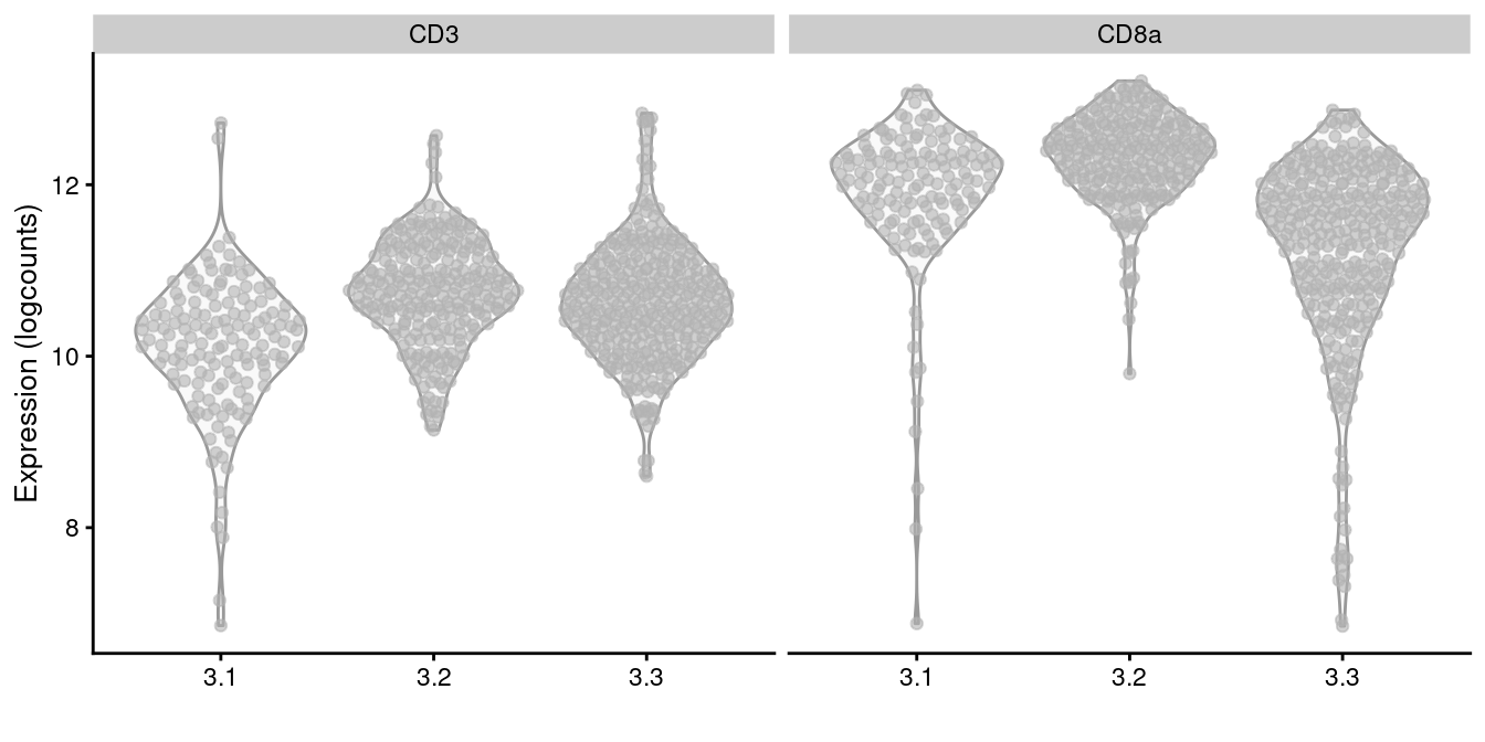
It is a good idea to perform some additional checks to ensure that each subcluster has similar protein abundances, e.g., using a heatmap as in Figure \@ref(fig:heat-tags) or with a series of plots like in Figure \@ref(fig:subcluster-tag-dist).
If so, this allows the subcluster to "inherit" the annotation attached to the parent cluster for easier interpretation.
```r
sce.cd8 <- all.sce[[of.interest]]
plotExpression(altExp(sce.cd8), x=I(sce.cd8$subcluster),
features=c("CD3", "CD8a"))
```
(\#fig:subcluster-tag-dist)Distribution of log-normalized abundances of ADTs for CD3 and CD8a in each subcluster of the CD8^+^ T cell population.
### By intersecting clusters
In contrast to subclustering, we can "intersect" the clusters generated independently for each set of features.
Two cells are only considered to be in the same intersected cluster if they belong to the same cluster in every feature set.
In other words, strong separation between cells in any feature set is sufficient to cause the formation of a new cluster.
The goal of the intersection is to capture population heterogeneity across all features in a single set of clusters.
To illustrate, we first perform some standard steps on the transcript count matrix to obtain an RNA-only clustering.
```r
sce.main <- logNormCounts(sce)
dec.main <- modelGeneVar(sce.main)
top.main <- getTopHVGs(dec.main, prop=0.1)
set.seed(100010) # for IRLBA.
sce.main <- runPCA(sce.main, subset_row=top.main, ncomponents=25)
library(bluster)
clusters.rna <- clusterRows(reducedDim(sce.main, "PCA"), NNGraphParam())
table(clusters.rna)
```
```
## clusters.rna
## 1 2 3 4 5 6 7 8 9 10 11 12 13 14 15 16
## 145 1638 56 1465 156 84 97 126 1664 296 73 42 750 75 189 371
## 17 18 19 20 21
## 144 33 18 27 23
```
A naive implementation of this intersection concept would involve simply concatenating the cluster identifiers.
However, this is not ideal as it generates many small clusters.
Here, most intersected clusters would contain fewer than 10 cells each, which is not helpful for downstream interpretation.
```r
naive.intersection <- paste0(clusters.rna, ".", clusters.adt)
summary(table(naive.intersection) < 10)
```
```
## Mode FALSE TRUE
## logical 47 76
```
A more careful approach is implemented in the `intersectClusters()` function from the *[mumosa](https://bioconductor.org/packages/3.17/mumosa)* package.
Given the per-feature-set clusterings and the coordinates used to generate them,
the function starts with the naive intersection but performs a series of merges to eliminate the smaller clusters.
Specifcially, we choose a pair of clusters to merge that minimizes the gain in the within-cluster sum of squares (WCSS);
this is repeated until the WCSS of the intersected clusters exceeds the WCSS of any per-feature-set clustering.
In this manner, we remove irrelevant partitionings without forcibly merging clusters that are well-separated in one of the feature sets.
```r
library(mumosa)
clusters.intersect <- intersectClusters(
clusters=list(clusters.rna, clusters.adt),
coords=list(
reducedDim(sce.main, "PCA"),
t(assay(altExp(sce.main)))
)
)
table(clusters.intersect)
```
```
## clusters.intersect
## 1 2 3 4 5 6 7 8 9 10 11 12 13 14 15 16
## 1618 162 7 54 1119 56 327 362 41 184 323 248 65 745 198 69
## 17 18 19 20 21 22 23 24 25
## 79 25 151 81 38 38 39 216 1227
```
Intersecting clusters is more convenient than subclustering as each feature set can be analyzed independently in the former.
Changes in the analysis strategy for one feature set do not affect the processing of other sets;
similarly, there is no need to choose one feature set to define the initial clusters.
The disadvantage is that there is no opportunity to improve resolution by choosing a more appropriate set of HVGs to separate subpopulations within each cluster.
### With rescaled expression matrices
Alternatively, we can combine the data from both modalities into a single matrix for use in downstream analyses.
The simplest version of this idea involves literally combining the log-normalized abundance matrix for the ADTs with the log-expression matrix (or the same with the corresponding matrices of PCs).
This requires some reweighting to balance the contribution of the transcript and ADT data to variance in the combined matrix, especially given that the former has at least an order of magnitude more features than the latter.
To do so, we compute the average nearest-neighbor distance in each feature set and use it as a proxy for uninteresting noise within each subpopulation.
Each matrix is then scaled to equalize the nearest-neighbor distances, ensuring that all modalities have comparable "baseline" variation without forcing them to have the same total variance (which would not be desirable if they captured different aspects of biology).
We demonstrate below by combining the log-abundance ADT matrix with the matrix of PCs derived from the log-expression matrix via the `rescaleByNeighbors()` function.
```r
# Re-using 'sce.main' from above.
rescaled.combined <- rescaleByNeighbors(sce.main, dimreds="PCA", altexps="Antibody Capture")
dim(rescaled.combined)
```
```
## [1] 7472 42
```
This approach is logistically convenient as the combined structure is compatible with the same analysis workflows used for transcript-only data.
For example, we can use the `rescaled.combined` matrix for clustering or dimensionality reduction (Figure \@ref(fig:rescaled-tsne-adt)) as if we were dealing with our usual matrix of PCs.
```r
library(bluster)
clusters.rescale <- clusterRows(rescaled.combined, NNGraphParam())
table(clusters.rescale)
```
```
## clusters.rescale
## 1 2 3 4 5 6 7 8 9 10 11 12 13 14 15 16
## 431 512 1283 80 130 84 1705 40 23 55 64 19 57 331 750 39
## 17 18 19 20 21 22 23 24 25 26 27 28 29 30 31 32
## 75 996 80 36 50 42 13 22 26 19 377 46 24 16 13 34
```
```r
reducedDim(sce.main, "RescaledNeighbors") <- rescaled.combined
set.seed(1000)
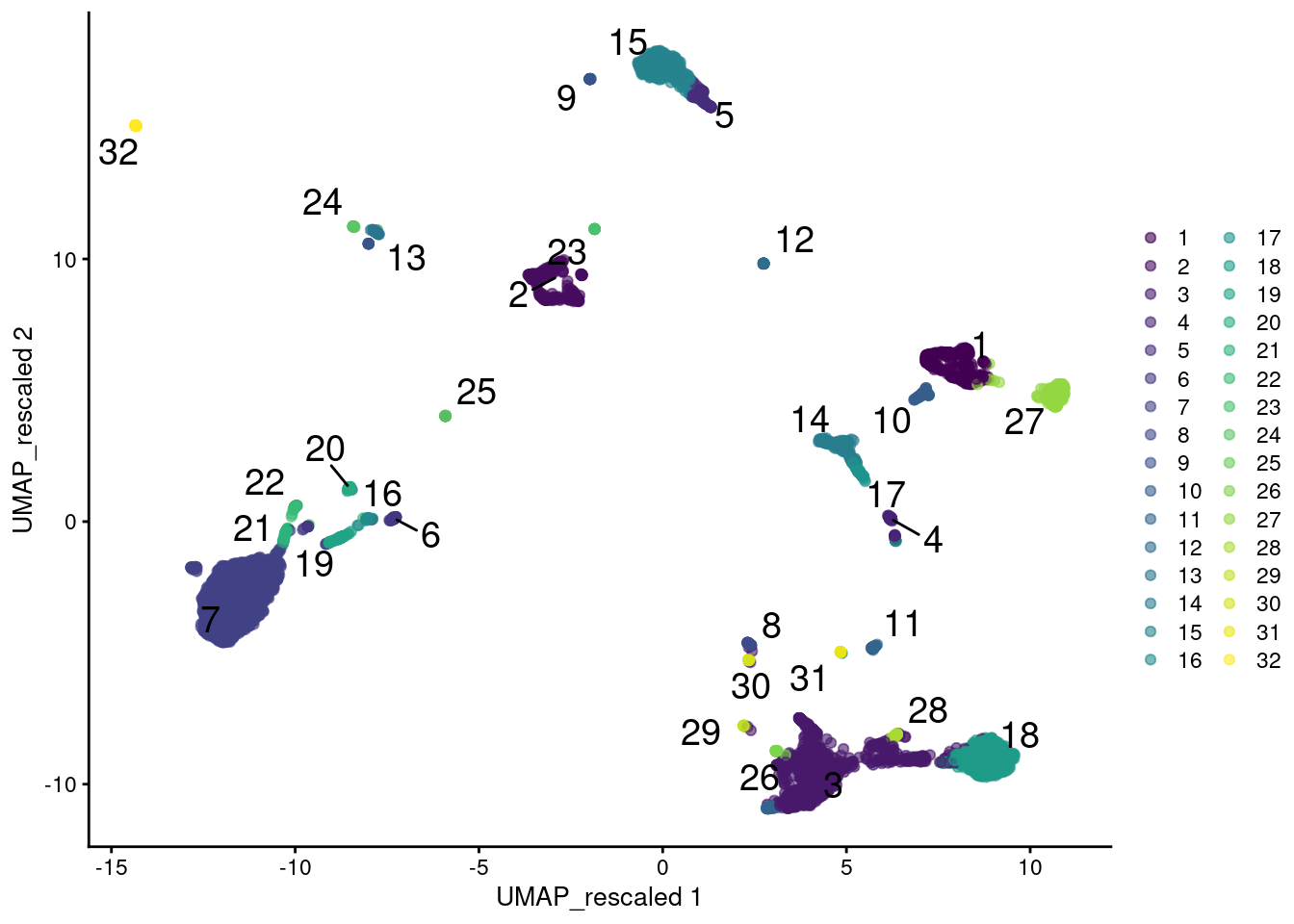
sce.main <- runUMAP(sce.main, dimred="RescaledNeighbors", name="UMAP_rescaled")
plotReducedDim(sce.main, "UMAP_rescaled",
colour_by=I(clusters.rescale), text_by=I(clusters.rescale))
```
(\#fig:rescaled-tsne-adt)UMAP plot of the PBMC data generated from rescaled ADT and RNA data values. Each point is a cell and is colored according to the assigned cluster from a graph-based approach.
However, this strategy implicitly makes assumptions about the importance of heterogeneity in the ADT data relative to the transcript data.
In this case, we are equalizing the within-population variance across feature sets but there is no reason to think that this is the best choice - one might instead give the ADT data twice as much weight, for example.
More generally, any calculations involving multiple sets of features must consider the potential for uninteresting noise in one set to interfere with biological signal in the other set.
This concern is largely avoided by subclustering or intersections, where a clearer separation exists between the information contributed by each feature set.
### With multi-metric UMAP
A more sophisticated approach to combining matrices uses the UMAP algorithm [@mcInnes2018umap] to integrate information from two or more sets of features.
Loosely speaking, we can imagine this as an intersection of the nearest-neighbor graphs formed from each set, which effectively encourages the formation of communities of cells that are close in both feature spaces.
The UMAP algorithm then uses this intersection to generate a matrix of coordinates that can be directly used in downstream analyses.
We demonstrate this process below using the `runMultiUMAP()` function, setting `n_components=20` to return a reasonably faithful high-dimensional representation of the input data.
```r
set.seed(1001010)
umap.combined <- mumosa::calculateMultiUMAP(sce.main, dimreds="PCA",
altexps="Antibody Capture", n_components=20)
dim(umap.combined)
```
```
## [1] 7472 20
```
Graph-based clustering on `umap.combined` generates a series of fine-grained clusters.
This is attributable to the stringency of intersection operations for defining the local neighborhood;
cells are only placed close together in the UMAP coordinate space if they are also close together in each of the feature sets.
We perform another round of UMAP to generate a 2-dimensional representation for visualization of the same intersected graph (Figure \@ref(fig:combined-umap)).
```r
clusters.umap <- clusterRows(umap.combined, NNGraphParam(k=20))
table(clusters.umap)
```
```
## clusters.umap
## 1 2 3 4 5 6 7 8 9 10 11 12 13 14 15 16
## 140 582 94 396 179 798 879 391 271 1050 548 163 67 66 95 819
## 17 18 19 20 21 22 23 24 25 26 27 28 29 30 31 32
## 130 39 57 64 25 22 50 23 31 26 63 45 30 48 44 37
## 33 34 35 36 37 38
## 62 23 34 33 27 21
```
```r
set.seed(0101110)
sce.main <- mumosa::runMultiUMAP(sce.main, dimreds="PCA",
altexps="Antibody Capture", name="MultiUMAP2")
colLabels(sce.main) <- clusters.umap
plotReducedDim(sce.main, "MultiUMAP2", colour_by="label", text_by="label")
```
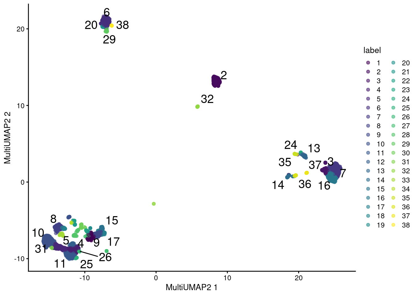
(\#fig:combined-umap)UMAP plot obtained by combining transcript and ADT data in the PBMC dataset using a multi-metric UMAP embedding. Each point represents a cell and is colored according to its assigned cluster.
The same concerns mentioned for `rescaleByNeighbors()` are also relevant here.
For example, both sets of features contribute equally to the edge weights in the intersected graph,
which may not be appropriate if the biology of interest is concentrated in only one set.
The use of UMAP for both clustering and visualization may also reduce the effectiveness of plots like Figure \@ref(fig:combined-umap) as diagnostics, as discussed in [Basic Section 4.5.3](http://bioconductor.org/books/3.17/OSCA.basic/dimensionality-reduction.html#visualization-interpretation).
## Finding correlations between features
Another interesting analysis involves finding correlations between gene expression and the abundance of surface markers.
This can provide some information about the regulatory networks or pathways that might be driving a phenotype of interest -
for example, which genes are up- or down-regulated in response to increasing PD-1 abundance?
We use the `computeCorrelations()` function to quickly compute all pairwise Spearman correlations between two feature sets.
```r
all.correlations <- computeCorrelations(sce.main, altExp(sce.main),
use.names=c("Symbol", NA))
with.pd1 <- all.correlations[all.correlations$feature2=="PD-1",]
with.pd1 <- with.pd1[order(with.pd1$p.value),]
head(with.pd1[which(with.pd1$rho > 0),])
```
```
## DataFrame with 6 rows and 5 columns
## feature1 feature2 rho p.value FDR
##
## 1 IL32 PD-1 0.238841 2.04014e-97 2.43020e-95
## 2 TRAC PD-1 0.236039 4.00402e-95 4.63760e-93
## 3 CD3D PD-1 0.208997 1.57594e-74 1.38727e-72
## 4 LTB PD-1 0.196742 4.32165e-66 3.31255e-64
## 5 TRBC2 PD-1 0.193617 5.00589e-64 3.69993e-62
## 6 B2M PD-1 0.191855 7.04541e-63 5.09311e-61
```
```r
head(with.pd1[which(with.pd1$rho < 0),])
```
```
## DataFrame with 6 rows and 5 columns
## feature1 feature2 rho p.value FDR
##
## 1 FCER1G PD-1 -0.287557 3.19929e-142 6.04856e-140
## 2 CST3 PD-1 -0.285696 2.47246e-140 4.60590e-138
## 3 TYROBP PD-1 -0.275635 2.25594e-130 3.83876e-128
## 4 MNDA PD-1 -0.274989 9.52972e-130 1.61082e-127
## 5 AIF1 PD-1 -0.274390 3.60656e-129 6.06450e-127
## 6 CSTA PD-1 -0.271784 1.13681e-126 1.86058e-124
```
Of course, computing correlations across all cell types in the population is not particularly interesting.
Strong correlations may be driven by cell type differences, while cell type-specific correlations may be "diluted" by noise in other cell types.
Rather, it may be better to compute correlations for each cluster separately, which allows us to focus on the more subtle regulatory effects within each cell type.
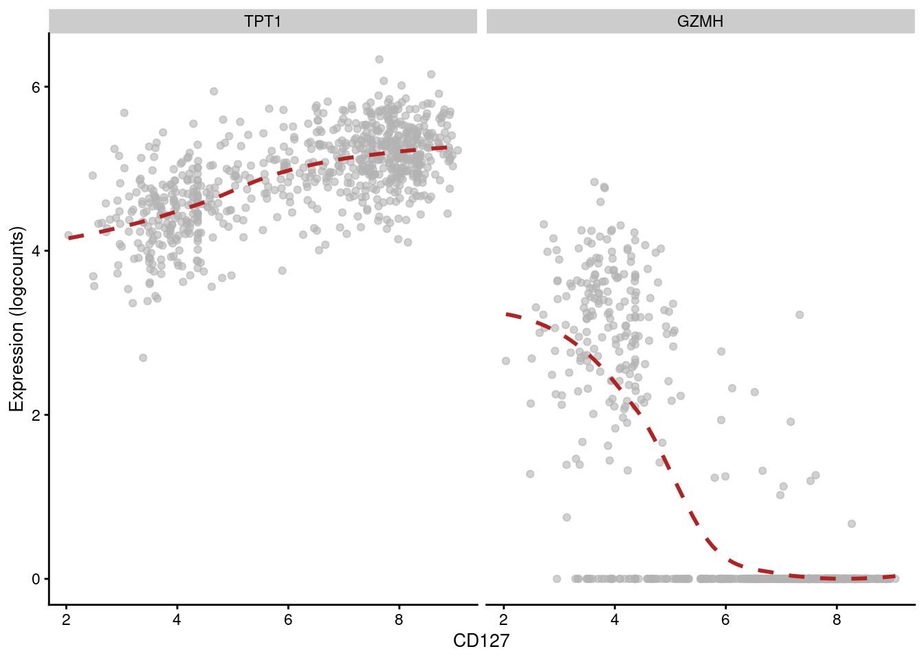
For example, in cluster 3, we observe that CD127 abundance is positively correlated with _TPT1_ but negatively correlated with _GZMH_ (Figure \@ref(fig:correlation-cd127-cluster)).
```r
chosen <- clusters.adt == of.interest
chosen.correlations <- computeCorrelations(sce.main, altExp(sce.main),
subset.cols=chosen, use.names=c("Symbol", NA))
sorted.correlations <- chosen.correlations[order(chosen.correlations$p.value),]
head(sorted.correlations[which(sorted.correlations$rho > 0),])
```
```
## DataFrame with 6 rows and 5 columns
## feature1 feature2 rho p.value FDR
##
## 1 IL7R CD127 0.785613 3.38336e-155 8.63677e-150
## 2 KLRB1 CD127 0.746670 4.36446e-132 5.57062e-127
## 3 HLA-DRB1 TIGIT 0.624707 6.62063e-81 2.11258e-76
## 4 TPT1 CD127 0.605186 9.77116e-75 2.49430e-70
## 5 CD8B CD8a 0.593515 3.00970e-71 6.40245e-67
## 6 GZMH TIGIT 0.591745 9.88881e-71 1.94180e-66
```
```r
head(sorted.correlations[which(sorted.correlations$rho < 0),])
```
```
## DataFrame with 6 rows and 5 columns
## feature1 feature2 rho p.value FDR
##
## 1 GZMH CD127 -0.711815 9.86062e-115 8.39047e-110
## 2 KLRB1 TIGIT -0.683086 2.88695e-102 1.84239e-97
## 3 TMSB10 CD127 -0.677936 3.50310e-100 1.78849e-95
## 4 IL7R TIGIT -0.652214 2.21674e-90 9.43121e-86
## 5 HLA-DRB1 CD127 -0.647804 8.53002e-89 3.11068e-84
## 6 TMSB4X CD127 -0.623470 1.67726e-80 4.75732e-76
```
```r
plotExpression(sce.main[,chosen], x="CD127", show_smooth=TRUE, show_se=FALSE,
features=c("TPT1", "GZMH"), swap_rownames="Symbol")
```
(\#fig:correlation-cd127-cluster)Expression of _GZMH_ and _TPT1_ with respect to CD127 abundance in each cell of cluster 3 in the PBMC dataset.
For experiments with multiple batches (or other uninteresting categorical factors), we can use the `block=` option to only compute correlations within each batch.
The results are then consolidated across batches to obtain a single `DataFrame` of statistics as before.
This ensures that correlations are not driven by differences between batches; it also focuses on feature pairs that have correlations with the same sign across batches.
To demonstrate, assume that we are interested in correlations that are consistently present in all cell types.
As such, clustering is an uninteresting factor of variation that can be specified in `block=`.
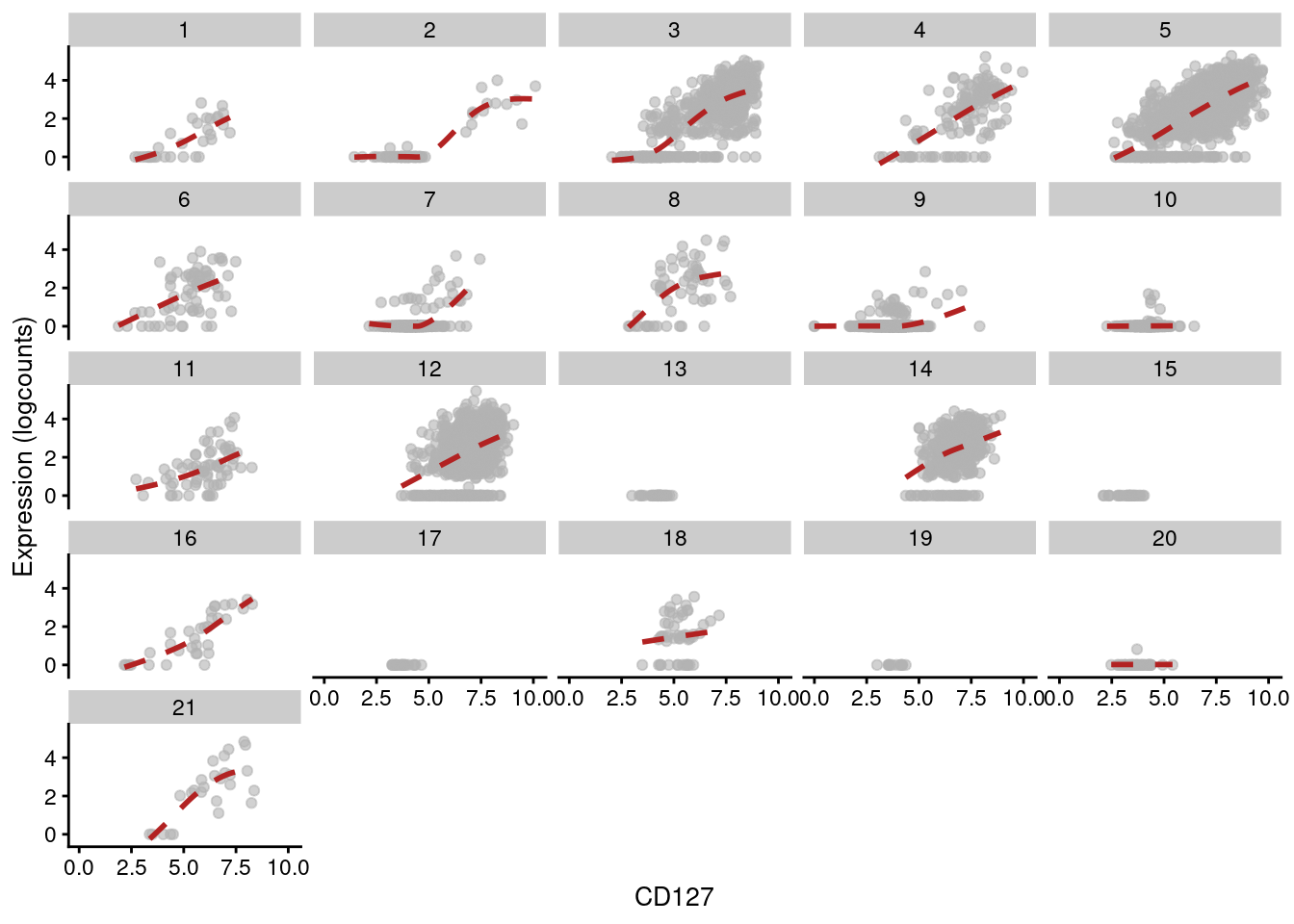
This yields a number of gene/protein pairs with strong correlations - many of which, unsurprisingly, involve the gene responsible for producing the protein, e.g., _IL7R_ and CD127 (Figure \@ref(fig:correlation-pd1-blocked)).
```r
# Using multiple core for speed.
library(BiocParallel)
blocked.correlations <- computeCorrelations(sce.main, altExp(sce.main),
block=clusters.adt, BPPARAM=MulticoreParam(4), use.names=c("Symbol", NA))
blocked.correlations[order(blocked.correlations$p.value),]
```
```
## DataFrame with 570146 rows and 5 columns
## feature1 feature2 rho p.value FDR
##
## 1 IL7R CD127 0.445280 1.68084e-214 5.98058e-209
## 2 TIGIT TIGIT 0.202662 2.90230e-45 5.16333e-40
## 3 EEF1A1 CD127 0.207421 7.86897e-42 9.33286e-37
## 4 CD8B CD8a 0.220594 2.28886e-39 2.03599e-34
## 5 RPS12 CD127 0.189224 1.40630e-36 1.00075e-31
## ... ... ... ... ... ...
## 570142 hsa-mir-1253 TIGIT NaN NA NA
## 570143 hsa-mir-1253 CD127 NaN NA NA
## 570144 hsa-mir-1253 IgG2a NaN NA NA
## 570145 hsa-mir-1253 IgG1 NaN NA NA
## 570146 hsa-mir-1253 IgG2b NaN NA NA
```
```r
plotExpression(sce.main, x="CD127", show_smooth=TRUE, show_se=FALSE,
features=c("IL7R"), swap_rownames="Symbol",
other_fields=list(data.frame(clusters=clusters.adt))) + facet_wrap(~clusters)
```
(\#fig:correlation-pd1-blocked)Expression of _IL7R_ with respect to CD127 abundance in each cluster of the PBMC dataset. Each facet represents a cluster and each point represents a cell in that cluster.
For large feature sets, computing all pairwise correlations may not be computationally feasible.
Instead, we can use the `findTopCorrelations()` to find the most correlated features in one set for each feature in the other set.
This uses a nearest-neighbors approach in rank space to identify the top closest genes for each protein marker, which is equivalent to an exhaustive pairwise search;
we further speed it up by performing a PCA to compact the data by approximating the distances between genes in a lower-dimensional space.
The example below will find the top 10 genes in the RNA data that are correlated with the abundance of the markers in the ADT data.
(Though in this case, the number of features in ADT data is small enough that an exhaustive search would actually be faster.)
```r
set.seed(100) # For the IRLBA step.
top.correlations <- findTopCorrelations(x=altExp(sce.main), y=sce.main,
number=10, use.names=c(NA, "Symbol"), BPPARAM=MulticoreParam(4))
top.correlations$positive
```
```
## DataFrame with 170 rows and 5 columns
## feature1 feature2 rho p.value FDR
##
## 1 CD3 CD3G 0.653505 0 0
## 2 CD3 LDHB 0.620759 0 0
## 3 CD3 CD3D 0.704559 0 0
## 4 CD3 TRAC 0.707055 0 0
## 5 CD3 TCF7 0.550894 0 0
## ... ... ... ... ... ...
## 166 IgG2b AP004609.1 0.02217055 0.0276600 1
## 167 IgG2b SLC30A4 0.02121528 0.0333445 1
## 168 IgG2b ADAMTS1 0.00630101 0.2930218 1
## 169 IgG2b LIX1-AS1 0.00563289 0.3131881 1
## 170 IgG2b SPATC1 0.00538439 0.3208383 1
```
## Session Info {-}